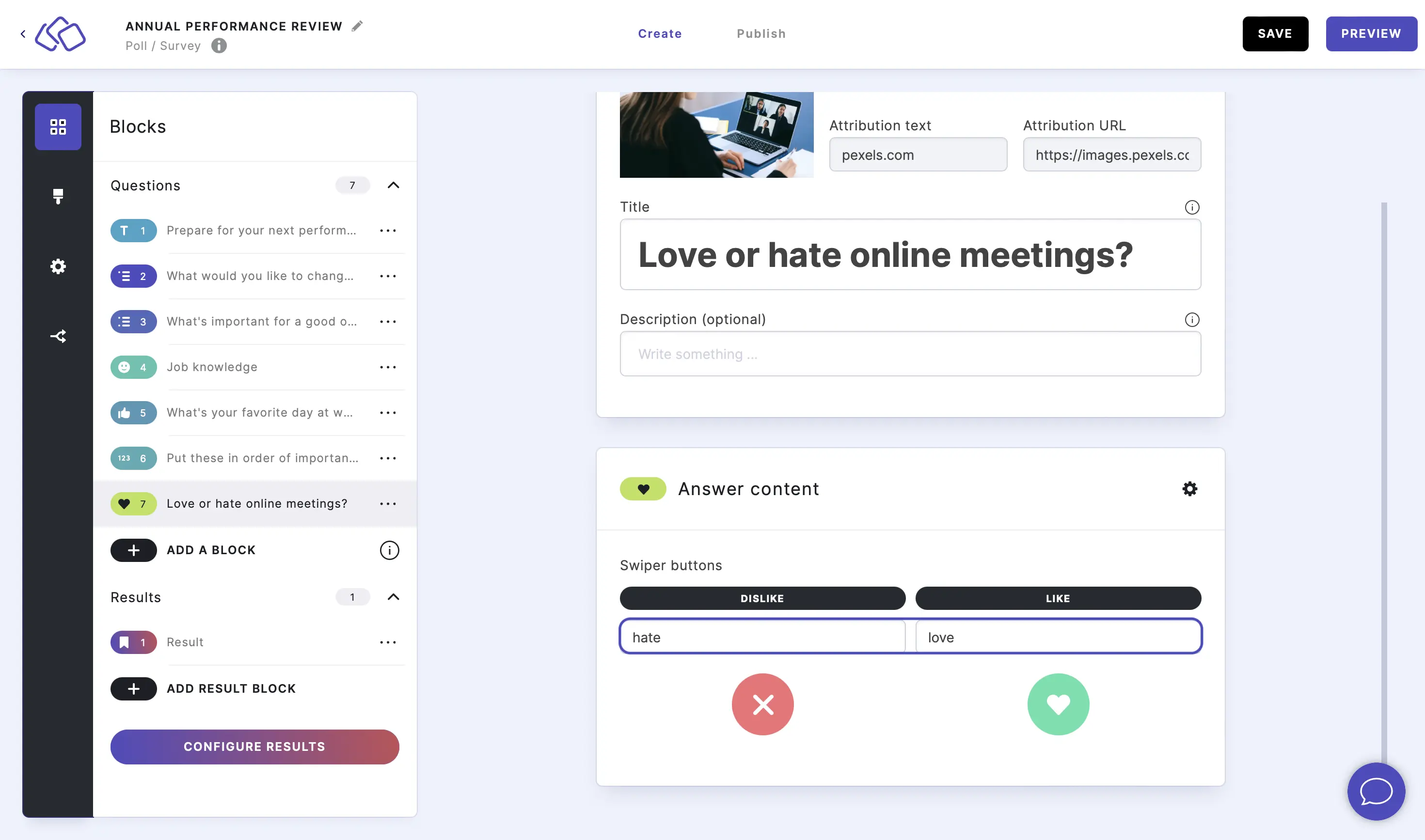
Swiper
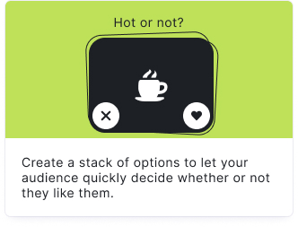
Your audience selects their preference by choosing between options - like or dislike. The Swiper uses an engaging swipe or button interface for quick binary feedback.
Setup
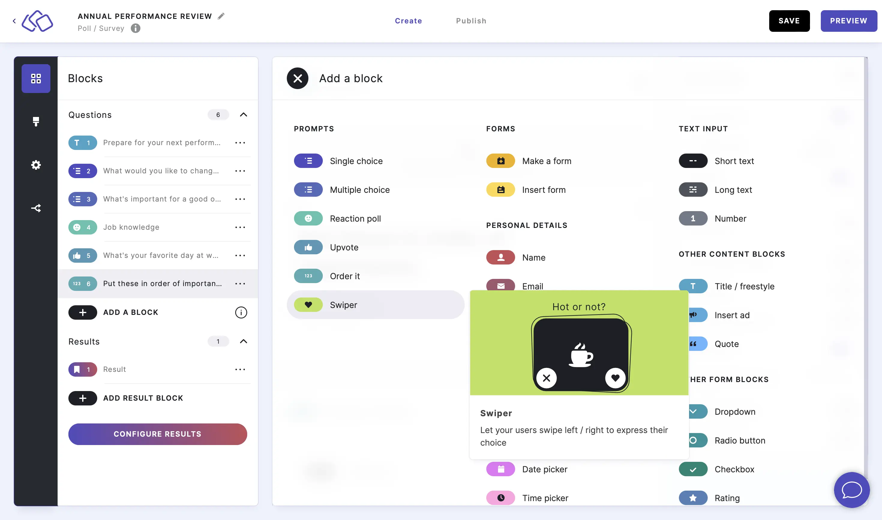
- Click on ADD A BLOCK and select Swiper.
- Type a question or text into the Title field.
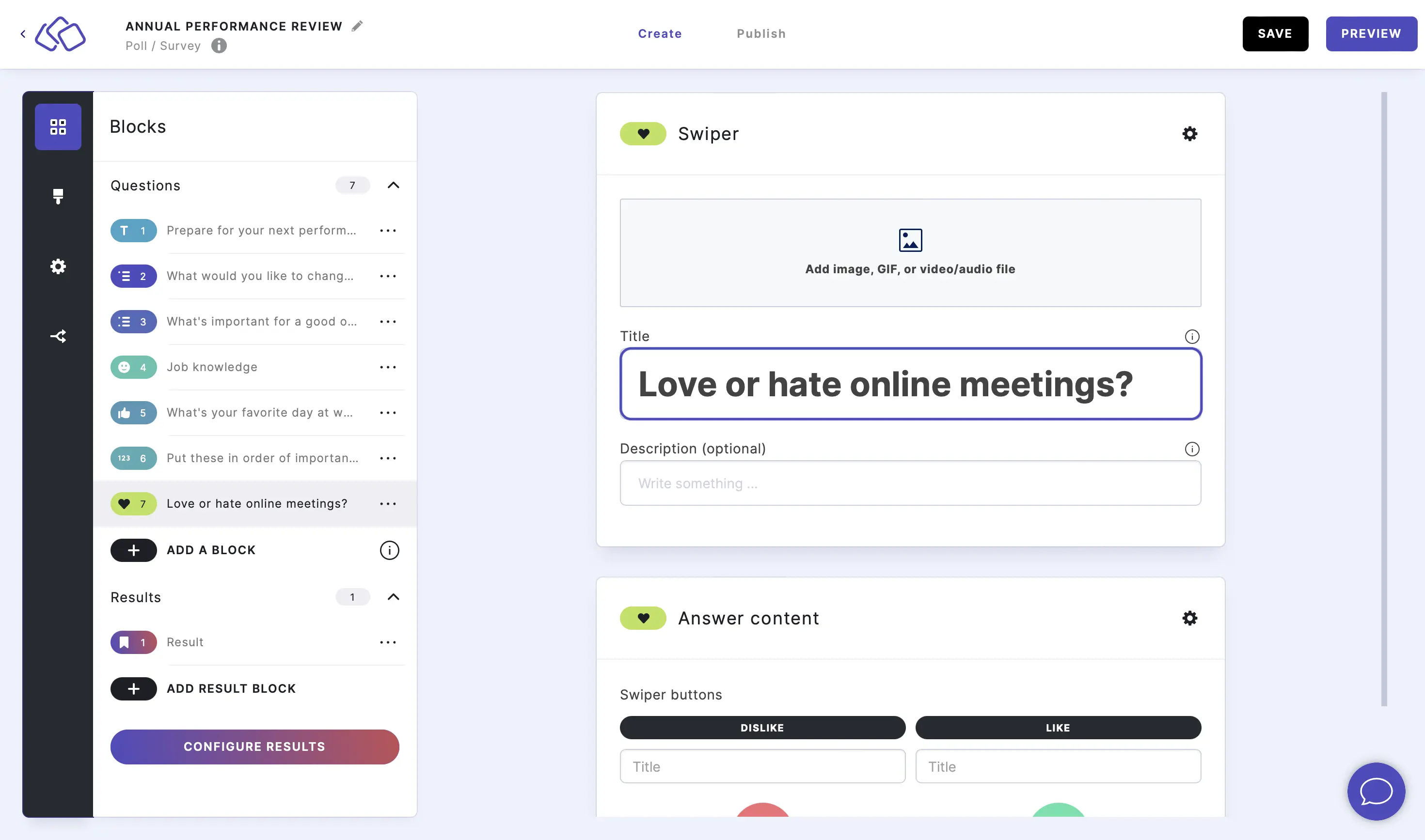
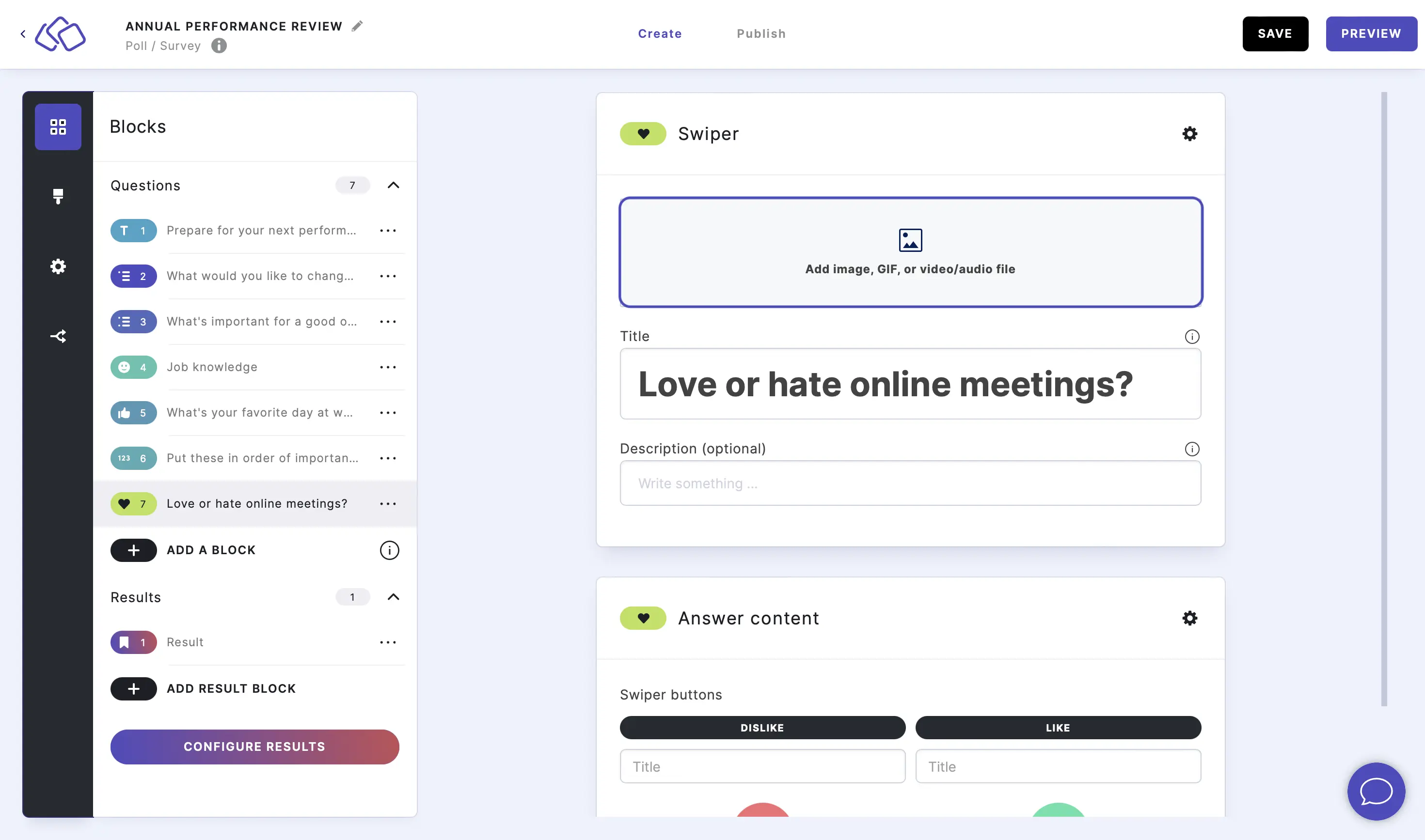
- Add an image by clicking on Add image, GIF, or video/audio file.
- Enter text into the Dislike title box and Like title box (optional).
Options
Click on the options icon on the right to configure the following settings.
Media
| Option | Description | Default |
|---|---|---|
| Show media | Toggle to show or hide the block's main image. | ON |
| Media ratio | Choose the aspect ratio: From settings, Wide 16:9, Square 1:1, Tall 3:4, or Original ratio. | From settings |
Required
| Option | Description | Default |
|---|---|---|
| Required | When enabled, your audience must answer this block before proceeding. When disabled, a "Skip" button appears. | ON |
Answers
| Option | Description | Default |
|---|---|---|
| Button type | Choose the style of the Dislike/Like buttons from the dropdown menu. | Riddle style |
| Button Dislike color | The background color of the Dislike button. | Black |
| Icon Dislike color | The icon color inside the Dislike button. | White |
| Button Like color | The background color of the Like button. | Green |
| Icon Like color | The icon color inside the Like button. | Dark |
Change the Dislike / Like buttons
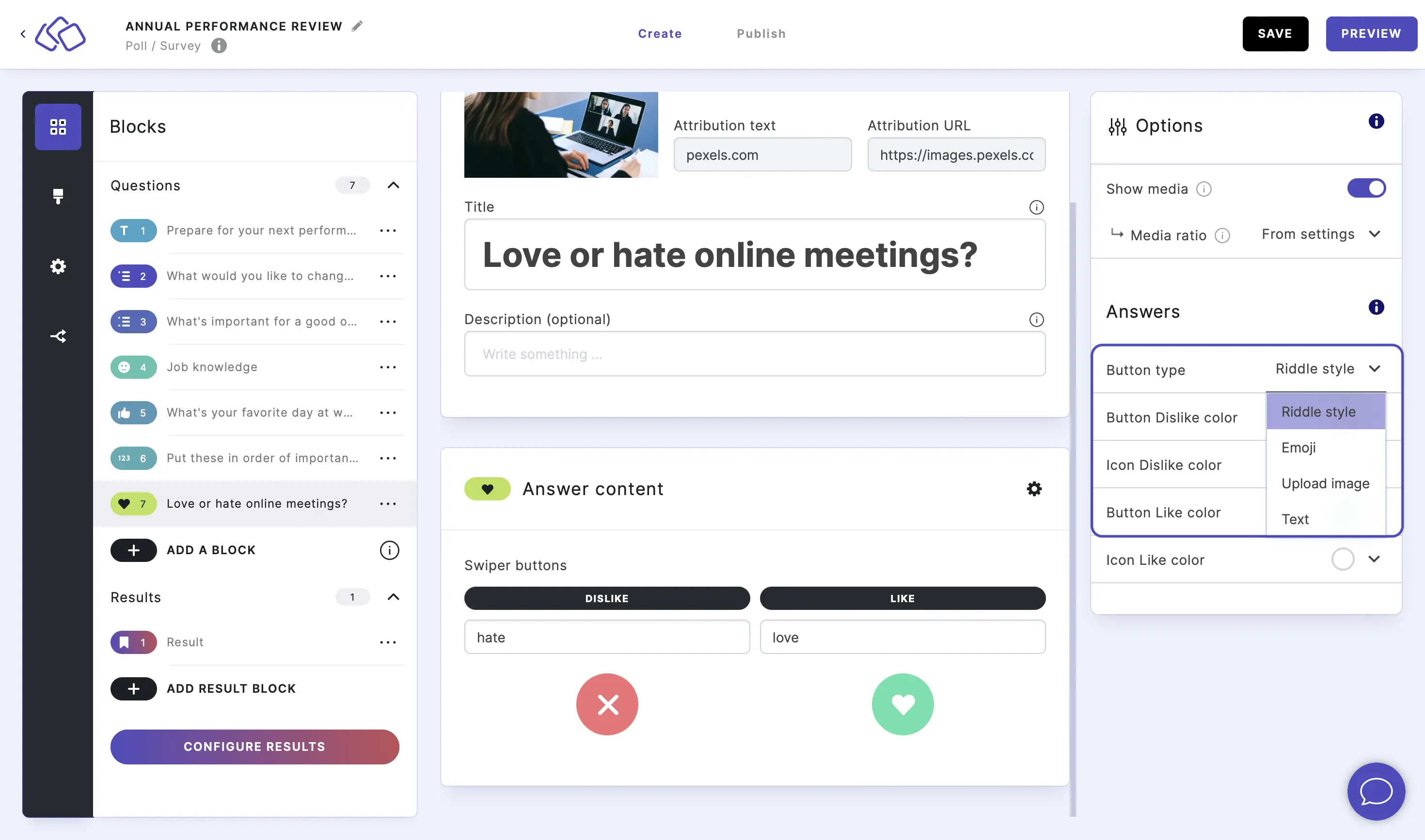
Go to the options icon on the right of Answer Content.
Click on the arrow next to Button type and choose an option from the dropdown menu.
For each of the four options, click on the buttons in the Riddle on the left to change the emoji, picture, or text.
Customize the button / icon colors
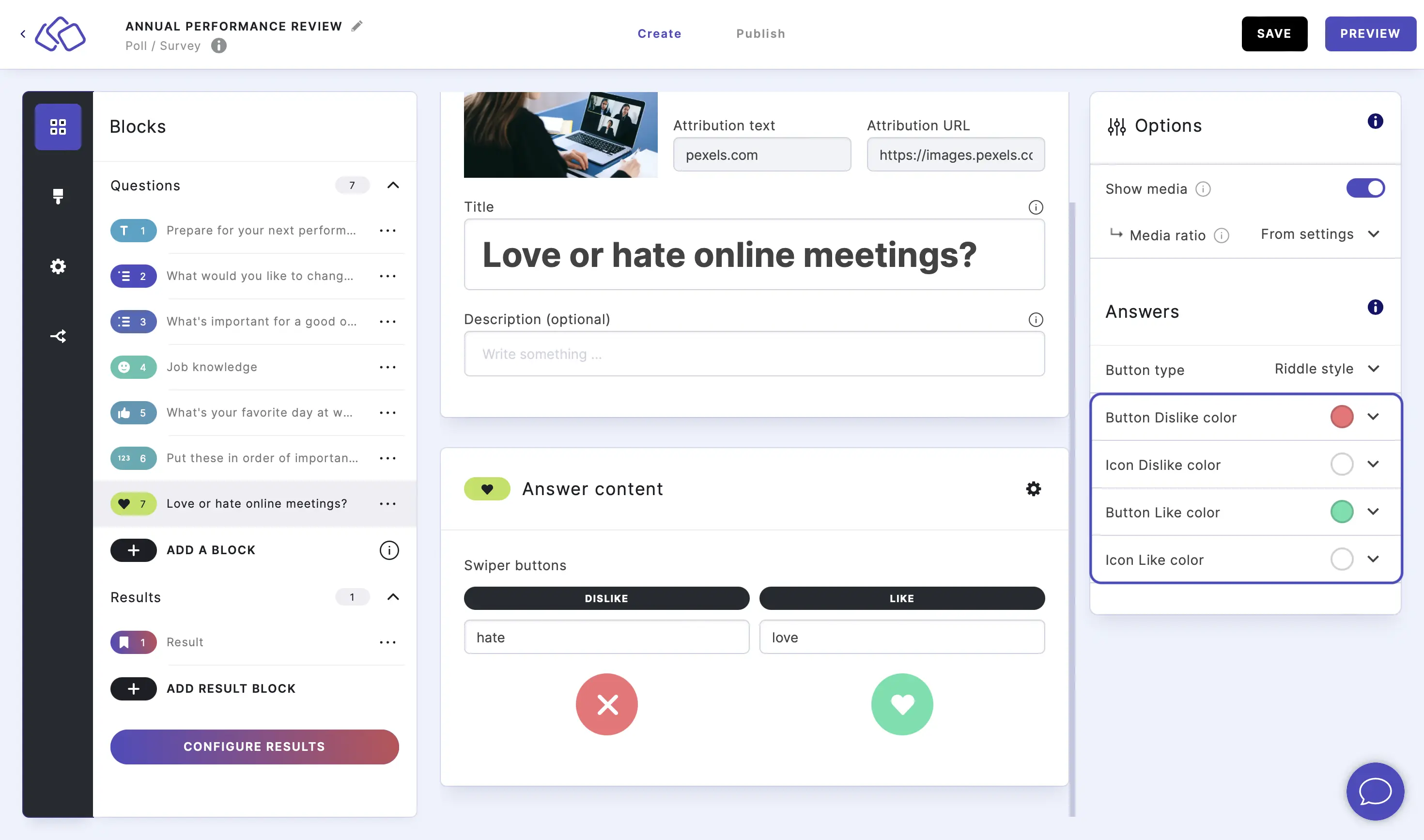
Go to the options icon on the right of Answer Content.
Click on the arrow next to Button / Icon Dislike / Like colors and select or enter a color. You can customize each of the four color settings independently to match your brand or design preferences.
Related articles: