
Other content blocks
You can combine any of these blocks into your Riddle.
1. Text / media
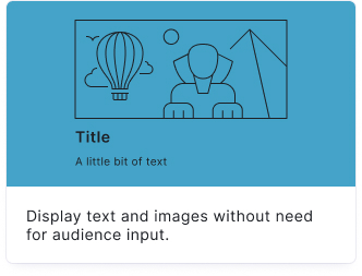
You can create a text / media block to inform or entertain your audience without a question.
- Click on ADD A CONTENT BLOCK and select Text / media.

- Insert your text into the Title field.

- Add an image by clicking on Add image, GIF, or video/audio file.

2. Quote
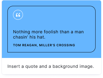
You can enter important quotations or statistical data.
- Click on ADD A CONTENT BLOCK and select Quote.

- Add an image, quote text, and the author in the Content section fields.

- Customize the background and text colors by clicking on the Options icon on the right of Content and selecting colors from the dropdown menus under Quote.

- Add text into the Title field (optional).

- Add an image by clicking on Add image, GIF, or video/audio file (optional).

3. Interactive Graphic
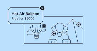
Add hotspots to an image your audience can interact with. Clicking or tapping a hotspot displays more details, or drills down to another image. Perfect for product tours, illustrated maps, infographics, or any visual that benefits from layered information.
- Click on ADD A CONTENT BLOCK and select Interactive Graphic.
- Add a heading in the Title field and optional supporting text in the Description field.
- Click on Add image, GIF, or video/audio file to upload your main image.
- Click anywhere on the image to place a hotspot. Hotspots are numbered automatically (#1, #2, …) and can be dragged to reposition. Click the Edit details button on a hotspot to jump to its configuration field below.
- For each hotspot, fill in the field that appears below the image:
- Media – optional image, GIF, or video shown in the hotspot popup
- Label – short text shown next to the hotspot on hover
- Title – bold heading shown at the top of the popup
- Description – optional body text shown in the popup
- (Optional) To enable drill-down navigation, upload additional images. Each drill-down image gets an editable heading (default: Image #x). For hotspots on the main image, an On click/tap dropdown lets you choose between:
- Show info window – opens a popup with the content you set
- Switch to a different image – navigates to the selected drill-down image
- Use the toolbar above each hotspot field to access:
- Highlight on Map – scrolls up to the image and highlights the hotspot's location
- Position – enter exact coordinates for pixel-perfect placement
- Delete – removes the hotspot
- Collapse – collapses the hotspot field
The hotspot's field header shows its number — or a link icon if it leads to a drill-down image — along with its label.
Drill-down rules
- Hotspots on a drill-down image can only show an info window — they cannot link to another image. Only one drill-down layer is allowed.
- Circular navigation between images is prevented automatically.
- A drill-down image can only be deleted when no hotspots still reference it.
- A hotspot cannot be completely empty — at minimum, add a Title.
Audience view
- The image is shown full-width with a toolbar to zoom and pan. On mobile, your audience can pinch and drag; on desktop, the +/- buttons or ⌘+scroll work the same way.
- Hotspots appear as numbered, pulsing dots. On desktop, hovering a hotspot shows its label as a tooltip.
- Hotspots that are too close together are grouped automatically — tapping a group zooms in until they separate.
- Tapping a hotspot opens its popup or swaps to its drill-down image, depending on what you configured.
- When a drill-down image is open, a back button with a thumbnail of the previous image appears in the toolbar.
Block options
Click on the Options icon on the right of Interactive Graphic to configure the following settings.
| Option | Description | Default |
|---|---|---|
| Hotspot background | Background color of the hotspot dots. | #1A1A64 |
| Hotspot text | Text color of the number inside each hotspot. | #FFFFFF |
| Show media in info pop-up | Toggle to show or hide media inside the hotspot popup. | ON |
| Media ratio (Info pop-up) | Aspect ratio for media inside the popup. Hotspot dots and drill-down images always use their original ratio. | Wide (16:9) |
Media options for Text / media and Quote
Click on the Options icon on the right of Content to:
- Disable Show media to hide the media area
- Choose a Media ratio for the displayed image