You can easily customize all of your quiz colors with any of our online quiz creator plans (BASIC / PRO / TEAM).
Unlike most other quiz maker tools, even our entry-level BASIC plan gives you the same standard set of customization options.
Getting started with customizing your quiz colors
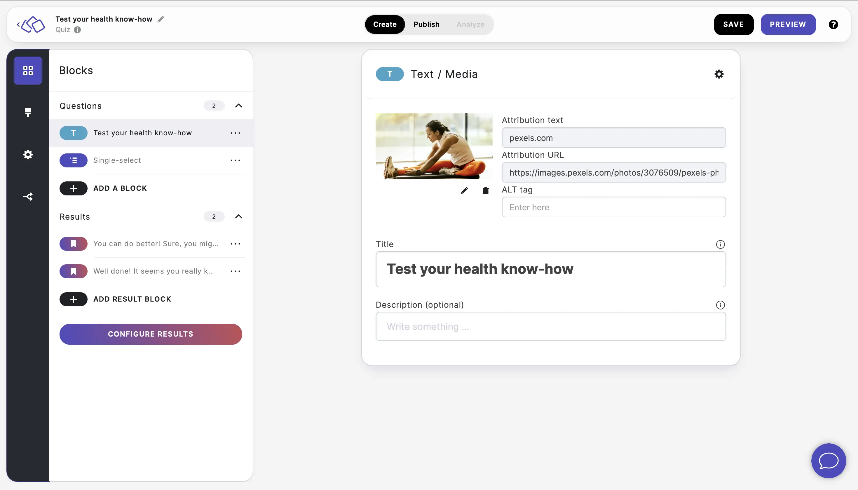
- We’ve got you covered. Just go to our ‘customize’ step when creating or editing your quiz.
- Select one of our suggested colors – or pick the exact hex color for your needs.
You’ll see all of the options available:
- Key color – this sets the main color throughout the quiz, used for buttons, social share icons, etc.
- Background colorsย – help your quizzes ‘pop’ visually on the screen, with a snazzy background color.
- Background patterns –ย go beyond colors, and add visual texture with different patterns.
- Font colors – from Montserrat to Arimo, customize the color of your text to match your quiz colors.
- Want to set different colors for different parts of your quiz? You can use our rich text editor (Pro plan) in the create step, or our CSS editor (Team plan).
Accessibility options
We’re proud that Riddle is an accessible online quiz creator – with features that make sure your quizzes and interactive content are useable by your entire audience.
(Why is accessibility important? It’s becoming a legal requirement in more and more countries.)
As part of this commitment, we’ve added some buttons and link color options – to help your audience with visual or other accessibility issues.
- Selected button colors: You can change the color of buttons when clicked.
- Color border for buttons/links: Make your text hyperlinks and buttons stand out with a custom color border.
Video: Changing quiz colors
We know text and images are a good start with help documentation, but video walkthroughs are even better.
Check out the video below – our co-founder Mike shows how to use each of our color options:
Transcript
Here’s a handy video transcript – in case you prefer to speedread the information, or if you’re using a screen reader or other tool. Riddle’s an accessible quiz builder – so we like to make sure our blog is as well.
*******
Hi there, my name’s Mike and I’m one of the co-founders here at Riddle. In this video, I’m just going to give you a quick walkthrough of how you can customize your quiz colors.
Now, unlike a lot of quiz maker tools, even on our basic, which is our lowest plan, we give you almost every customization option. So, as we go through this video, no matter what plan you’re on, you should have a lot of good ways to change your quiz colors.
OK, so first off, you want to create a quiz and then head over to our โcustomizeโ step and click on our Customize or our colors section. I’ll now run through each of these steps so you can see how they are applied.
First up, the key color that applies to most of the main elements of a quiz. So you’ll see here, I’ve got pink as I’ve set up, but I’m going to change it to an orange or maybe even a red.
And you’ll see here – this changes to read the highlight states change to red, and then also when you get to our end of quiz experience, you’ll see that you have the key colors here, this main button.
So we are at font colors. Now let’s change colors from a black to, let’s say, a frankly ugly red. Just to show you how that changes up, I’m going to go back to the black or kind of a dark gray.
For the hyperlinked font color, it will actually change this link here. So if I change that to an orange, you’ll see here that changes button text.
On button text colors, we normally recommend a white button, but sometimes you might want to change the text from white to, let’s say, you know, again, black.
(One note, this does not affect call to action buttons, which is a Pro feature. And you can customize all that stuff in terms of button colors and roundness and text and things like that.)
OK, back up to quiz colors โ and going to the background color. We normally recommend having a color that is slightly different than your website. So if your website’s background is white, you might want to change a slight gray. It helps to have your quiz stand out a bit. Or if your website is a darker color, you might want to go back to that white just to give you some options.
Again, we do have some different layouts and different style presets, which again, give you some different options. But that’ll be another video.
OK, background color is now white.
You could also set our accessibility features around colors – these are designed for people who are using screen readers and things like that. I’m going to change this to orange, which is about links and buttons, and then I’m also going to change the highlight state for any buttons (like start or play again) to a lovely pink.
Now watch what happens when I go to our published quiz. Imagine you’re using a keyboard navigation so you can’t use a mouse, which happens for a lot of folks who might have some issues using their hands. And I’m just going to tab through the quiz for now.
Watch to see that little link right here is now orange. This is a navigation aid where people were using these. They can see where they’re at.
And likewise, you see this button here, they’ve now changed this button and selected the color is now changed to that lovely pink, which again, it’s a visual aid to people using navigation tools to let them know where they’re at.
So let’s just go through the entire quiz quickly. And actually, you see here those orange highlights. That’s something that’s that pink again, which we just showed you. And then as I scroll through, you got these other options.
OK, so that is our customization options around quiz colors.
But if you have any questions at all, just use our support. Chad, we love to help out and we’re super happy to respond.
Thanks so much. And Happy Riddling!