Want to add ‘call to action’ buttons to your quiz? You can do that with any of Riddle’s quiz maker plans – perfect quiz takers different offers or guiding them to different URLs based around their quiz results.

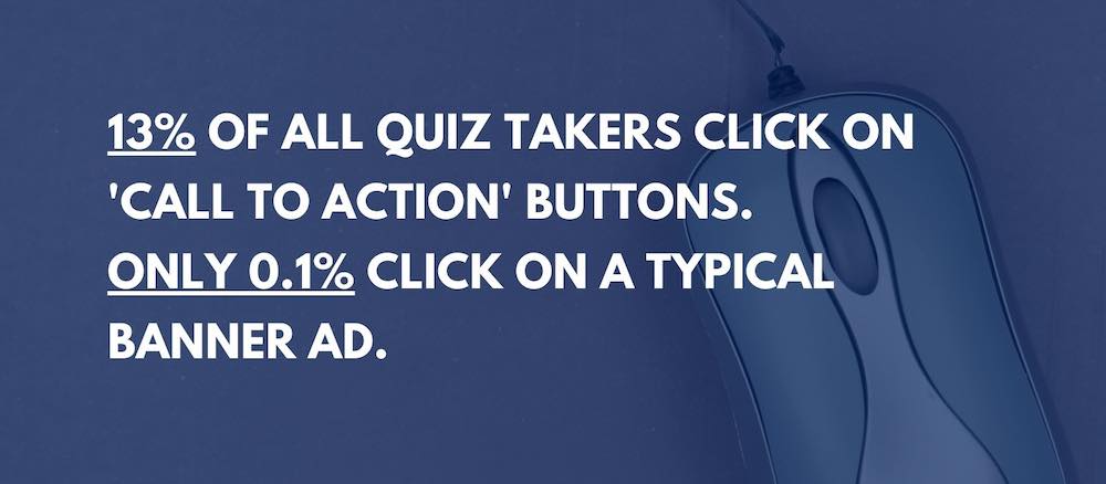
It’s easy – AND effective. An average of 13% of all quiz takers clicks on them – compared to 0.1% for typical banner ads.
And call to action buttons are all ‘opt-in’ advertising.
Forget showing annoying banner ads or other interruptions. With call to action buttons, your quiz takers get to decide if they want to engage.

Call to action quiz buttons – how do they work?
We’ve made Riddle’s online quiz maker super flexible, so you have two ‘call to action’ button options:
- Present the same offer to all quiz or personality test takers
- Show different offers based on each person’s results.
Option 1 – present the same offer to all users:
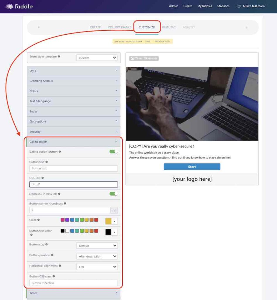
- Go to the ‘Customize‘ step in the quiz creation process
- Click on ‘Call to action’ to add a customizable ‘buy now’ button to the last page of your quiz.
- Fully customizable, you can change the color, location, and look and feel – to match your site’s look and feel.
- Imagine you run a travel site. You could place a ‘Save 25% on Hawaii vacations’ button (or Paris, Africa, etc.) at the end of your ‘What’s my dream trip?’ quiz.
- Your ‘buy now’ button would link to your site’s purchase page for their holiday package (we used Wikitravel in our example).

Option 2 – Different offers based on quiz responses:
- In the ‘Create‘ step, go to each result type for your quiz or personality test
- Click the ‘Call to action’ switch for each result.
- Add in compelling text. For example, in our vacation example – you could show ‘Save 25% on your Hawaii holiday’ to beach lovers, and ‘Save 25% on your Paris getaway’
- Just like our example above, these buttons will display in the user’s results screen – when they’re most ready to act.
- Note: you can’t mix and match CTA settings. Option 1 is a quiz-wide setting and will override any individual CTA buttons you set using option 2.
Multiple call to action buttons in one result
While the default options in Riddle allow for just one call to action button in each result, our Pro and Team Plan users can add as many buttons as they like with a small hack. You can read more about that here. Note: styling these buttons requires our Team Plan, which provides access to the Riddle CSS.
Call to action buttons – video overview
Call to action quiz buttons – best practices
There’s almost no limit to how you use ‘call to action’ buttons. They’re perfectly placed to capture your audience’s attention. Coming at the end of your Riddle quiz, your readers have just received their results and are now subconsciously thinking ‘What’s next?’.
We’ve seen our community leverage this to their advantage, adding ‘call to action’ buttons to promote:
- Sales – offer discounts on specific products that match each user’s quiz results
- Sign ups – get more subscribers to newsletters
- Suggested content – promote additional articles, around the audience’s tastes
Right – that’s enough for now.
We hope that you’re as excited as we are about this new feature on Riddle’s quiz creator. Big thanks to our community who suggested this!
Video transcript: How to use call to action buttons
(We try to include video transcripts as part of our effort to make our blog as accessible as our quiz maker. Transcripts are great for folks with disabilities using screen readers and other devices.)
********
Hi there, my name is Mike and I’m one of the co-founders here at Riddle. And in this video, I’m going to show you how you can use our call to action buttons to present special offers or to direct users to different URLs, all based on their quiz results.
So it’s really cool. And this is such a great way to continue the quiz experience, because at the end of a quiz, people are kind of like, “Well, that was fun, but what do I do next?”
So let’s show you how a call to action button looks and feels. Now, in this case, we have a basic cyber security quiz. Now, I’ve skipped ahead to the last question. And I’m back – after I’ve finished my quiz. There is the lead form in this case. I’m not going to fill it out, but here’s the call to action button comes in. So in this case, I’m a user who doesn’t know very much about cybersecurity. So in this hypothetical business case, I’m going to present a special offer for basic cybersecurity courses.
Now, however, what if someone knows a lot about cybersecurity? Giving a discount on a basic course doesn’t make a lot of sense.
So in this case, you can say, “Well, I’m going to present advanced cybersecurity courses to them and I’m going to send them to a different URL.”
So so call to action buttons. You can have different buttons and different URLs for every result type. So in this case, we have two results and we have two different buttons.
The one other thing you can do is say, “Well, that’s great, but in this case, I’m going to send everybody to the same URL. I want to show the same button to everybody.”
This is a shortcut. If you click on ‘Customize’, then go down to the call to action setting, you can turn on this global call to action button. And this would be the same button for all result types. For now, I’m going to put in Riddle here as a placeholder.
But, you know, it shows same button to all users. And that’s that’s cool. Oh, and of course, you can style it and change colors and do all sorts of stuff, change the position, change the alignment. In this case, I’m going to make it really big. I’m going to put it after the description. I’m going to make it large as well.
Remember, if you are using the global call to action button, you will want to turn off these individual ones because they’re redundant and they might they might conflict with each other.
OK, there you go. So now we have our global call to action button. I’m going to skip ahead and I’ll show you how it looks.
OK, so here’s that lead form and now I’m coming to the end of the quiz and you’re seeing the same call to action button for all users. This shows the same button to every user, no matter what their quick results.
Any questions? Of course. Just use our support chat down here. You’ll get myself, our CEO Boris and the rest of our team responding quickly – most of the time in under two minutes. AThanks so much to Happy Riddling!